How to select and position photos for appealing two-page scrapbook layouts.
by Debbie Hodge
My family loves looking at scrapbook pages that tell the stories of our outings and get-togethers. We pour over layouts showing trips to the beach, museum visits and holiday celebrations. The photos prompt our memories of the day.
A good two-page layout not only includes the right photos, it also presents them so that they’re appealing to look at and convey the story of the event. If choosing and arranging photos for a two-page layout is a challenge for you, try following this three-step method.
1. Find the Keepers
Pull out all the photos from the event—whether they’re a stack of 4x6s or a folder of digital images on your computer. Make several passes through your photo options, winnowing them down to those that tell the story and record important particulars. Keep an eye out for one or two photos to use as a focal point.
Select photos for your layout that exhibit one or more of the following items:
- people key to the story
- interesting, relevant items (such as a garden shovel or the birthday cake)
- pertinent activity
- sense of location
- excellent photographic quality
Remove photos that have these drawbacks
- are close duplicates of others
- are of poor quality
- don’t add to the story

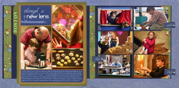
When my brother’s family visited the Boston Museum of Science with my family, there were so many of us and so much to see, I took far more photos than I could use on one spread. The winnowing down, though, wasn’t as hard as I’d anticipated. I knew I wanted to use the two portrait photos on the left of the layout: one of my niece peering into a holographic display and one of my husband helping my youngest son use a microscope. I also knew that the photo of the shells was a great shot as well as representative of our outing. In addition to those three, I wanted to include a photo of each child. I picked my favorites and then narrowed those down by selecting the photos that could be cropped to the same size and orientation.
2. Choose a Focal-Point Photo
A strong focal-point photo sets the story, gives the viewer a starting point on the page, and creates order and hierarchy. Look for a photo that does the following:
- represents of the story by means of people, location, item or activity
- exhibits great image quality (cropping or editing can help)
- engages the viewer
If your focal photo includes people, they should be engaged in a relevant activity or looking into the camera. Also, remember that fewer subjects are easier to feature than multiple subjects.
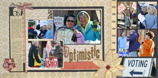
When I was creating Optimistic, a spread about a local election, I especially loved two photos. The first is of the two men speaking in front of a police car. My other focal-photo consideration was of a candidate and her mother, who is wearing a sandwich-board. Both photos are quality shots and good story-setters. I decided, though, that the photo of the women looking right into my camera was the more engaging and revealed more of the story.

Once you decide on your focal photo, you want to be sure you present it effectively. The object is to establish the photo’s importance on the page—to put it at the top of the visual hierarchy. To do so, use any or all of the following methods:
- size it so its larger than the other photos
- position it effectively
- mat it
- embellish it
I enlarged the focal photo in Optimistic to 5×7 and matted it on black paper. Background layers added two more mats. I positioned the photo one-third of the way down on the layout and ran made it span both pages. No other photo is as large, has as many mats, or sits in this key spot.
3. Place the Photos
Most of my two-page layouts have a focal-point grouping, a canvas smaller than the whole layout that can often stand on its own. Upon this canvas, the title, journaling and one or two smaller but important photos sit alongside the focal-point photo.

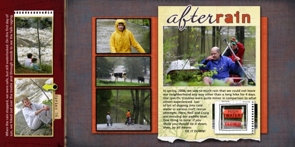
In After Rain, the yellow mat with its portrait orientation encompasses the focal-point grouping. It holds the layout’s title, journaling, focal-point photo, one supporting photo plus torn-edge and frame embellishments. Positioning and a strong, contrasting color add to its prominence.
Once your focal-point grouping is established, it’s time to push the rest of the photos around on your worktable or screen, looking for grouping possibilities that build an understandable story and offer good placement. You can group photos in many ways, including the following:
- by activity, such as sandcastle building, wave surfing or sunning
- by time, such as Easter preparations, egg hunt or dinner
- by similar orientation, such as landscape or portrait
- by overall or cropped size
My After Rain layout tells of the several days we were not able to leave our neighborhood because of flooding. I grouped the photos from the rainier, bleaker days together and cropped them all to the same width and landscape orientation. I planned on mounting two photos from the day the rain stopped in a separate group. These I cropped in portrait orientation.
Placing the focal-point grouping on your two-page canvas first defines the space available for supporting photos. For After Rain, I mounted the focal canvas in a prominent position just to the right of center. I then mounted the group most closely related to the focal-point photo on an orange-red mat in a landscape orientation under the focal-point grouping. This keeps these photos separate, yet connected, and the extra layer of matting gives the focal canvas more prominence.
I mounted the two after-the-rain photos on contrasting paper running the entire height of the layout, which creates a separate, yet related canvas.
Everyone loves stories. Tell them with effective two-page spreads, and you’ll find those layouts will become favorites—pages that you and your family turn to again and again.

