Embellishments can be used with other page elements to guide the viewer’s eye through the page. We all routinely scan our surroundings – even when we focus on a spot, we eventually change our field of vision. As we make this change, we do a quick scan of the environment. As we do this scan, we unconsciously look for elements that stand out—elements that contrast. On a scrapbook layout, contrast will draw the viewer’s eye into and through the page.
Z-flow
Our minds are used to reading in a z pattern (we read from left to right and back again to left) and the brain will look for a pattern that flows this way. You can place items on your scrapbook page on a z-path to guide the viewer’s eye through it.
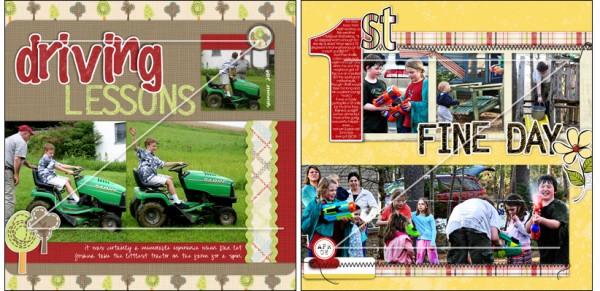
“Driving Lessons” and “First Fine Day” both have an underlying structure of two horizontal strips. Note also that they both have a strong element at top left (the large red “driving” on the first page and the bold “1” on the second). From there, photos and embellishments move in a horizontal line to the right. Now note that each of these z-flow pages has an interesting embellishment at bottom left where the eye is then drawn before proceeding across a second left-to-right sequence of photos.
Visual triangle
When you have three spots on your page that stand out and have something in common you create a visual triangle. The visual triangle works because the eye looks for things to put together, for a pattern to guide the eye and help make sense of the page. Additionally it’s based on that odd number—three—that’s so appealing in designs. Visual triangles are also great for pulling two pagers together, for drawing the eye across both of the pages and creating a sense that the two are one.
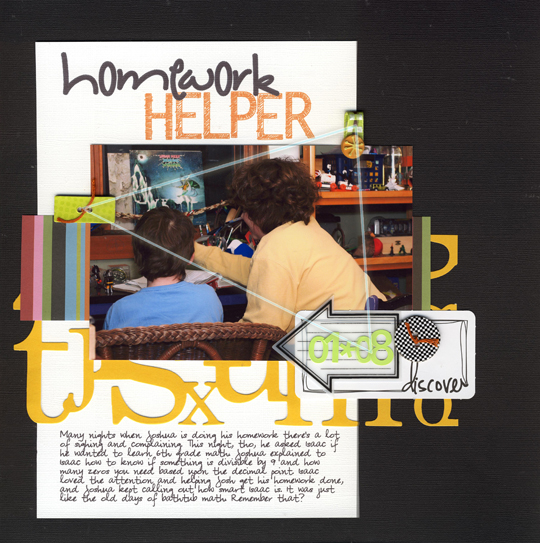
You can see a visual triangle at work in “Homework Helper.” This triangle is created by the three embellishment points, and, especially, the shared lime green at each point. At the left side of the photo it’s a chipboard button. At top right, there is lime green in the folded ribbon, and then at bottom right, green numbers finish the triangle. The great thing about a visual triangle is that it leads the eye right back around to the beginning (here the button) for further perusal of the page.
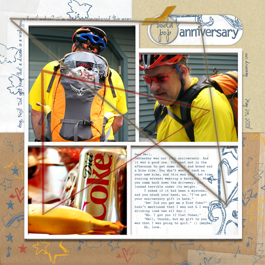
“Soda-Pop Anniversary” has two clear triangles. The first is made by the white paper with blue doodles that is repeated in the upper left corner, the tag at top right and the block at bottom right. A second triangle is created by the yellow in the three photos.
Sequential or horizontal
Moving across a page from left to right in a horizontal pattern is a comfortable flow if you’re a reader of western languages that go left to right. You can set up this kind of flow with:
- horizontal lines (of embellishments, strips of paper, lines)
- arrows
- a series of images
- sequenced text and/or photos
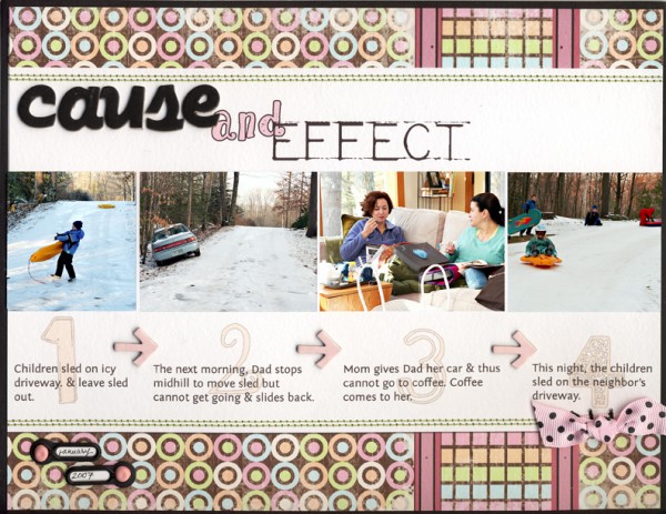
“Cause and Effect” uses sequenced photos along with corresponding text, chipboard arrows, and numbers to move the eye across and through the page.
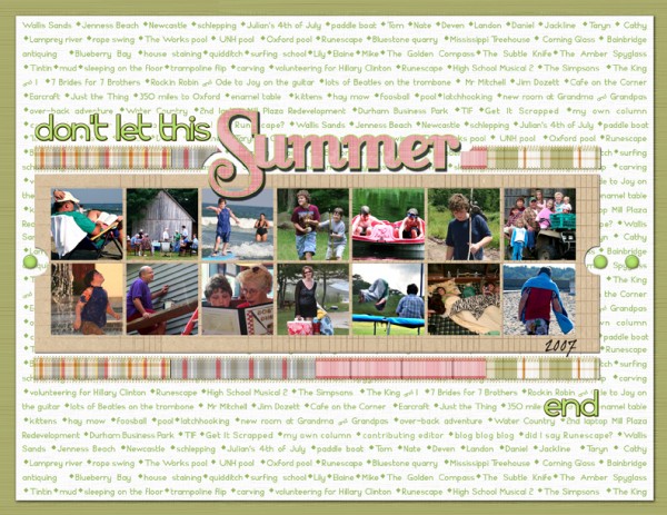
“Don’t Let This Summer End” uses several elements to create horizontal flow: 1) the mini brads that lead into the strip of photos and then out on the other side; 2) the strip of same size photos arranged in a horizontal block; 3) the movement of the title across the page; 4) the strips of patterned paper; 5) the background paper made of repeated words that are read left to right.
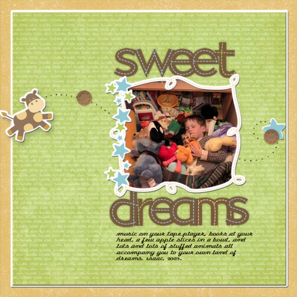
“Sweet Dreams” creates this type of flow with three embellishments, one photo, generous white space and a curve of stitching holes. The flow begins with the cow poised to “leap” across the page and continues to brad, photo, and final brad and star.

