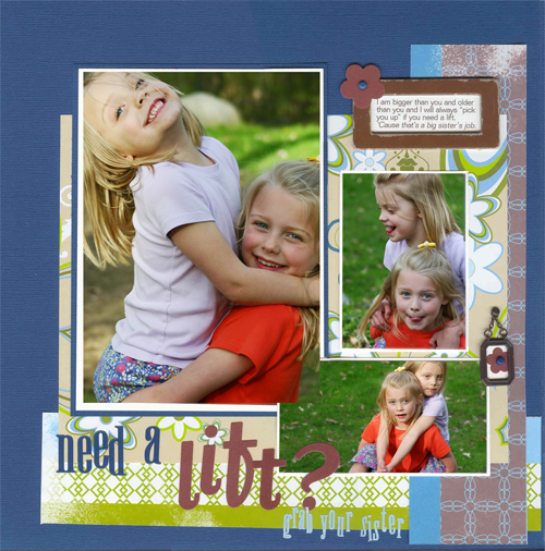
Without some variation in emphasis among the elements on your page, everything takes on the same level of importance and the viewer has to find some way into your page on their own. When emphasis exists, though, the viewer’s eye is drawn to a starting point and then (with some good “flow management”) knows where to continue. The result is the viewer “gets” what your page is about.
Emphasis is all about contrast
While we’re focusing on photos today, you may choose to emphasize different elements on the page (i.e., title, embellishments). The following ways to provide contrast can be applied to other elements on your page.

A 5”x7” enlargement is the focal point in “Need A Lift.” “At Trail’s End” uses a photo smaller than the others for its focal point. On each of these pages, size is not the only technique being used to emphasize a photo. Once you’ve gotten through the list that follows, come back to see what else sets these photos apart on their respective pages.
size
Using an enlargement alongside smaller photos will give a photo emphasis. Remember, though, that it’s not just about something being BIGGER. It’s about something being DIFFERENT. Thus a smaller photo can also play the role of attention-getter.
matting
Use color, width, and number of mats to emphasize a photo. See how double matting the photo in “Need a lift” gives the enlargement added interest. Because the photo’s bottom mat is the same color as the background canvas, there’s a great flow into the photo at its top where the dark blue mat sits directly on the dark blue canvas and seems not to exist.
dimension/layering
Raise up your focal point photo with pop-dots. Layer your focal photo over other photos in a collaged design.
embellishment
Embellish your photo with distressed photo edges, rub-ons, transparency overlays, digital brush effects, or whatever you may think of. Draw the eye to your photo with the layering of embellishments under and over parts of the photo. See how this is done in “At Trail’s End” to the right and “Life Celebration” below.
content & editing of photo
Your photo’s subject, as well as how you edit and crop it may be used to enhance its draw. The photo of two boys here is an engaging shot. Zoomed in closer, their faces and thumbs-up become more important and the photo takes on added interest. The 2nd version here was given some extra “oomph” with Photoshop help in the saturation, contrast, and lighting areas. Check out how the subject and cropping of this photo in “At Trail’s End” contrasts with that page’s supporting photos.
orientation & shape
Use a focal photo that’s landscape, and choose supporting photos that are of portrait orientation — or vice versa. Tilt your focal photo. Give it a different shape from the other photos; i.e., square or circle. “At Trail’s End” features a square focal photo with landscape supporting photos.

While “Life Celebration” is jam-packed with photos, there is one clear focal photo. The bright title leads the eye into the photo below it — a photo that is slightly larger than its neighbors, that is engaging, and that is embellished with gems, buttons, and flowers.
positioning
Place your focal photo in a “sweet spot” (i.e., divide your canvas in thirds horizontally and vertically and position the photo at one of the intersections of these dividing lines).
Another way to use positioning is to place your focal photo separate from the other photos. See how the focal photo in “At Trail’s End” and the focal photo in “Your Full Room” both use generous white space to set one photo apart from supporting photo groupings.

The focal photo in “Your Full Room” is a standard 4” x 6” photo yet becomes the focus because of its placement, its wide margins/white space, and the layering of the title at photo bottom.
the challenge
Scrap a multi-photo page with a focal photo and load it in the Get It Scrapped gallery. Link us up here and tell us what techniques you used to emphasize your focal photo.


